So while viewing The New Republic tonight it hit me that I should totally rip off their color scheme for my redesign. And I know I groveled at the feet of you six to help me pick a new color scheme, but we didn’t exactly come away with a clear winner, so I decided to just run with the inspiration and see where it took me. And do you know where it took me? Straight into 4 in the morning, that’s where. So thanks for voting, and sorry I acted like a true politician and said to hell with your suggestions — I’m stealing from somebody else altogether! You’ll never trust me again.
To be fair, this is, strangely enough, the exact same color scheme I whipped up in 2004 for the newspaper of the future! contest in design class where my team tied for first place. The strange thing is that I had never even heard of The New Republic back then, much less seen their website. It’s a classy group of colors. I’m really starting to like khaki and burgundy combinations in my old age. And the background, which I took from Squidfingers, is playful so it balances out the seriousness of the other two colors.
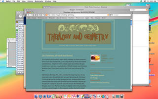
So theology&geometry v 4.0 is here hopefully for a long time. I’m dropping the bracket gimmick. I think it’s infinitely more legible than the dark teal color I had going on as a background before. But, for posterity, here’s what we’re leaving behind.
An improvement, yes? I haven’t yet viewed it in anything but Safari, so let me know if issues pop up in other browsers.

I really like the new design. I wish I knew enough to design my own!!
Thanks, Cheryl! It’s taken me a while to learn how to manipulate Blogger’s templates, but I finally feel like I know how. This one is based on the design called “Scribe.” I just replaced the background and changed the colors and fonts.
If you want me to work on a template for you, just let me know! I can’t do much except maybe build a nameplate (and you’ve already got a cute one) and change some colors and the background background, but I’d be happy to if you wanted me to. I’m still working on the day when I can build something from scratch!
Gorgeous! You’re a regular design-o-rama.
A.
It’s so purtiful… I really like your flag. The blue tiling, IMHO, is a bit much, but I’m pretty much against all things trendy, so take that with a grain of salt.
I’m starting to get an itch for a redesign on my site as well, but I think I’m going to try to hold off that urge until after graduation. I imagine I’ll have plenty of time to contemplate color schemes when I’m flipping burgers…
Bah…