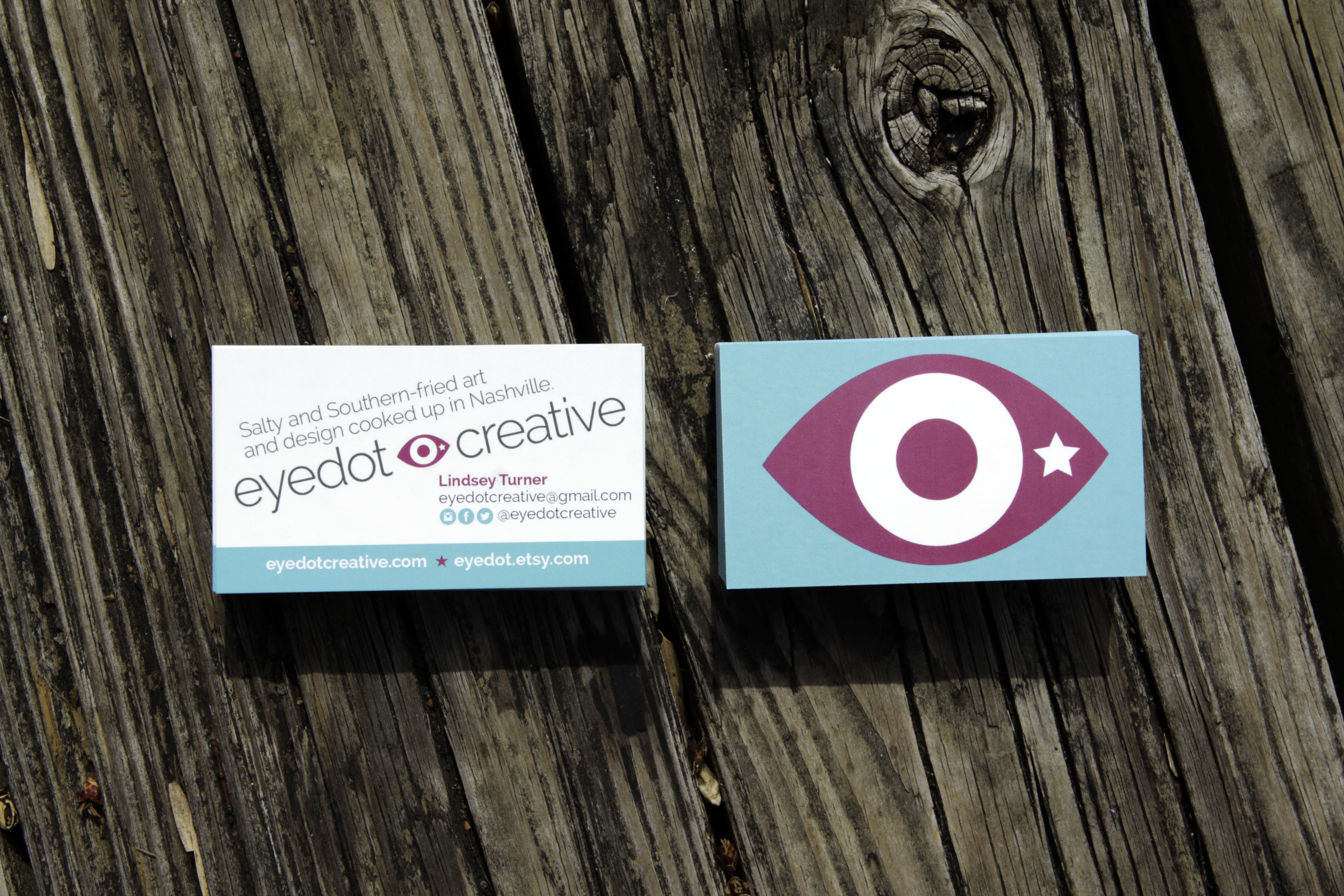
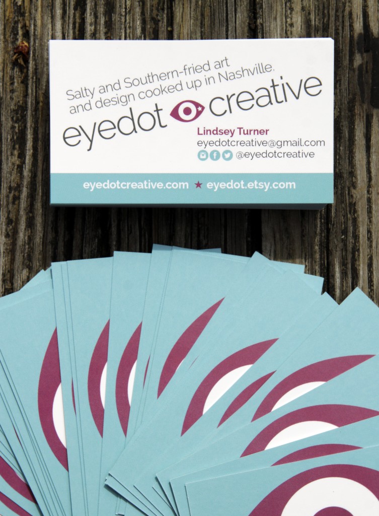
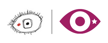
I’ve given the Eyedot Creative logo a little bit of an overhaul. I liked my little hand-drawn creepy eye but it wasn’t vector and didn’t lend itself to all the ways I need to use it. I wanted to keep the eye concept but make it sleeker, and make sure the weird little dot stood out.
So, here’s the new Eyedot logo. BOOM!


